
Responsive logo design: What it is and why you need it
Definition
The responsive logo dynamically adjusts to various devices/platforms, such as computers, tablets, and mobile phones, maintaining its aesthetics and clarity. It’s not just a technical detail but a strategic investment in communication.
Your logo is the flagship of your communication. The flexibility of a responsive logo enhances brand recognition and contributes to shaping a unified, modern image.
It is essential to create variations of your logo to ensure quality representation. Having a responsive logo provides you with:
• Timelessness
• Flexibility
• Recognizability
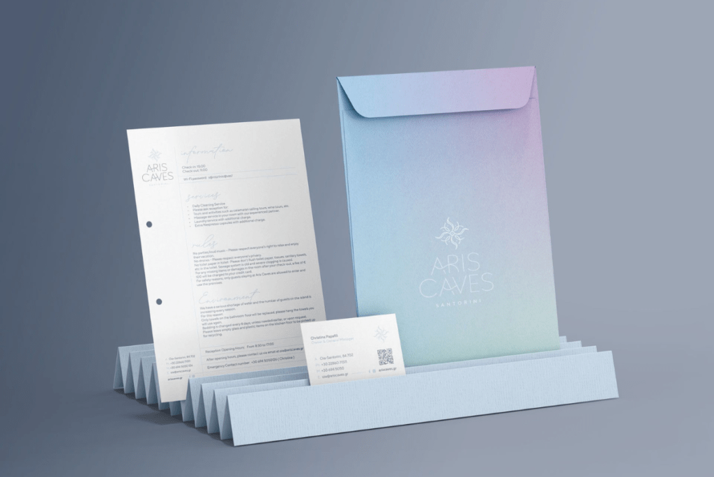
Whether printing your logo on promotional flyers, product packaging, business cards, or using it as an icon on your social accounts, you want it to be versatile and impactful in different situations.
» This is called responsive logo design.
To do
Create multiple versions of your logo.
Consider the placement and size of the logo. It is often preferable to create several different adaptive versions of the logo to anticipate even smaller placements.
Standard Version
The standard version is the most recognizable version of the logo, the one you see everywhere around you. It is simply the symbol and the brand name.
A slogan may also appear in certain cases.
Remember: “Less is more.” Strive for simplicity by minimizing elements.

Horizontal Version
The horizontal version corresponds to the logo integrated into the website. The logo is positioned on the left, followed by the brand name on the right.
Simple and effective, it allows you to display your logo in a horizontal format. Ideal for incorporation into letterheads or Facebook Ads.

Combact Version
This version of the responsive logo is most suitable for displaying your company’s symbol in a small square shape. This logo is often used as a base for creating a favicon on a website.
The favicon logo appears on your site’s browser tab and in Google search results (only in the mobile version).
Enhance Logo Visibility The smaller your logo, the more challenging it is to read.
It is essential for your logo to adapt to all possible situations. Your company name should not be too thin. Regarding typography, you need to find the right balance between a bold or thin font.

*If you are looking for legible fonts, check out the Google Fonts tool, where you have access to an extensive library with various fonts.
In summary, the responsive logo is a fundamental element of a modern corporate identity. With the ability to provide overall consistency in any environment, it creates a communicative bridge between the brand and the audience, enhancing the user experience.
*Read our article “Basic Principles of Designing a Successful Logo.”
Check out here some representative examples of responsive logos.
