
White space – The value of using it wisely
Whitespace is much more than ’empty space’ on a website. It is one of the most creative elements in web design and plays a crucial role in the user experience.
Definition
Whitespace on a website (or negative space) is the empty space between the content and various elements.
It balances the elements on the webpage, organizes the content and enhances the user’s visual experience.
Utility
Internet users mostly ‘scan’ instead of reading when they visit a website. They quickly scroll, often passing by elements and content they can’t focus on comfortably.
We all love minimal design… The key to grabbing their attention is simplicity – and it starts with the effective use of white space.
Many websites or mobile apps suffer from the accumulation of numerous elements and information. Visual clutter creates a poor experience for the visitor. By removing unnecessary elements, the website will ‘breathe,’ and the core message will reach the user more easily.
White space helps the visitor focus on the core message and understand the information easily.
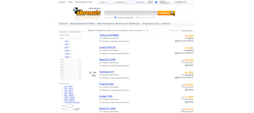
White space example → skroutz.gr

The term ‘white space’ can be somewhat misleading. While some examples of white space are indeed entirely white, this is not the case in all instances.
Any colour or arrangement can be used to create ‘negative space’ on a website.
“But let’s see how it got the name ‘white space’.”
Attributed to the early 20th-century Chinese artists, the empty spaces on the white rice paper they worked on were not regarded as lost space. They found meaning in the void and believed it contributed to the overall understanding of the image. White space later became well-known thanks to Modernism, which focused on minimalism (*Read our article on Minimal web design), structured grids, and negative space.
Micro-Macro white space
Small white space refers to the smaller gaps created around content. It can be found between letters, paragraphs, navigation links, or form fields.
On the other hand, large white space refers to larger areas of the website and can be found in the margins of a site, around the logo, in hero sections, and around CTA buttons.
The use of white space enhances the user experience and makes website visitors feel comfortable as they navigate. This allows them to focus more easily on what interests them.
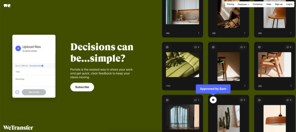
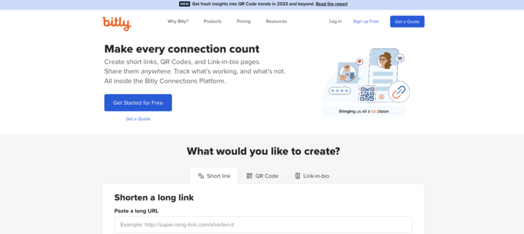
More examples of websites that use white space wisely and we like:


In conclusion, in every aspect of web design, white space serves as a powerful tool for enhancing the user experience and presenting content effectively. Thus, the effective use of white space is essential for creating a beautiful and functional website.
Check out samples of websites designed by our team.
Do you also need a website redesign?
